Interactive course map conversion mini golf turns a visual hole-by-hole tour into a clear path to booking. By showcasing signature holes, obstacles, par, and difficulty with mobile-friendly previews, families understand the experience before arrival, reducing hesitation and increasing purchase confidence.
Effective maps pair concise captions with accessible alt text, fast loading, and simple touch gestures. A persistent “Book Now” button and deep links to your booking engine keep the following step obvious. Track taps on holes, scroll depth, and map interactions to measure intent and refine layouts. The result is higher on-page engagement, fewer drop-offs, and more completed reservations.
Website Enhancements Mini Golf Bookings: Interactive Map Essentials
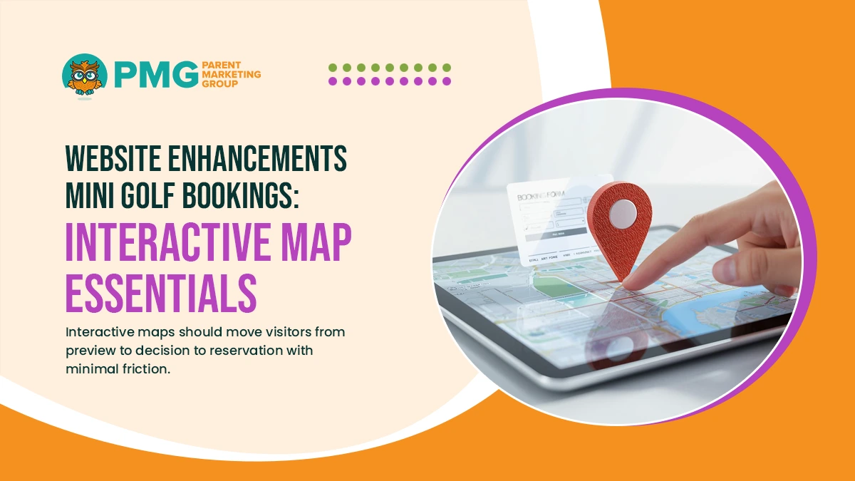
Interactive maps should move visitors from preview to decision to reservation with minimal friction. They should present course highlights clearly, keep actions visible on mobile, and connect every view to an immediate booking path.
Define the Map’s Role in the Booking Journey
Set expectations so the map supports a single-session decision. Introduce what guests will see and how they can reserve without leaving the context.
- Journey intent: Explain that the map helps visitors preview holes and reserve a time in one flow.
- Context cues: Show par, difficulty, and accessibility notes so families gauge fit quickly.
- Next-step clarity: Keep a primary “Book Now” action visible as guests explore.
- Trust elements: Place safety, weather, and waiver links adjacent to the map.
Close with a pointer to packages and pricing so selections align with capacity and budget.
Hole-by-Hole Cards and Content Standards
Consistency improves comprehension on small screens. Each hole should use the same short, scannable structure with helpful media.
- Structured fields: Include hole name, par, difficulty, and a concise feature line.
- Accessibility labels: Provide alt text and ARIA labels for every interactive element.
- Media mix: Pair one optimized image or short clip per hole to control load time.
- Helpful tips: Add a simple hint or fun fact to increase interest.
Finish cards with a subtle CTA linking to family-friendly packages that match typical group sizes.
Persistent CTAs and Deep Links to Booking
Reduce drop-off by keeping actions present and context-aware. The booking path should preserve choices and reflect real-time availability.
- Sticky primary action: Maintain a fixed “Book Now” button during scroll and zoom.
- Deep-link parameters: Pass date, party size, and package to prefill checkout.
- Cart persistence: Save selections so visitors return to the same review screen.
- Error handling: Offer nearby alternatives automatically if a slot sells out.
Confirm that tracking parameters follow the link so attribution remains accurate across sessions.
Visual Layout Conversion Tactics: Map UX and Booking Placement
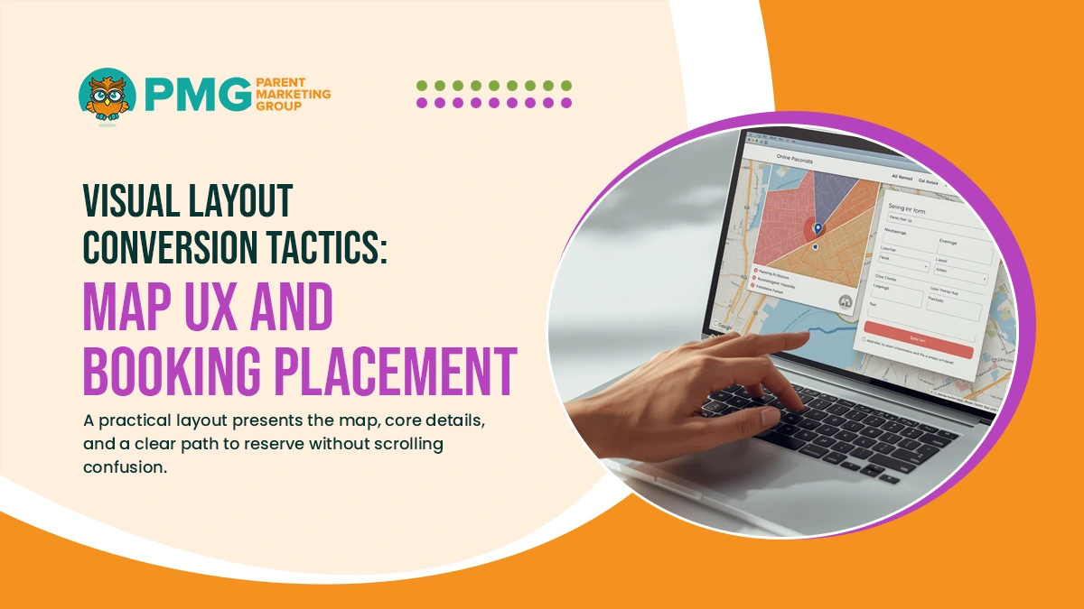
A practical layout presents the map, core details, and a clear path to reserve without scrolling confusion. The design should prioritize fast comprehension, persistent actions, and reassuring context near every booking prompt.
Above-the-Fold Structure
Place the most important elements in view immediately so visitors understand the experience and can act.
- Primary Hero: A concise headline and a short value line that explains what makes the course special.
- Map Preview: A tappable mini-map or featured hole that opens the full interactive view.
- Primary CTA: A visible “Book Now” button positioned near the preview and title.
- Key Facts: Short bullets for hours, location, and average visit time.
Close the section with a compact link to packages and pricing, keeping the first scroll focused and decisive.
Sticky CTAs and Progress Indicators
Maintain orientation as guests explore the map. Persistent controls keep the next step available and reduce friction.
- Fixed CTA Bar: A sticky “Book Now” control that remains visible during pan and zoom.
- Secondary Actions: “Pick Date,” “Party Size,” and “View Packages” surfaced as compact buttons.
- Progress Meter: A simple step indicator from Map → Package → Checkout.
- Mini Summary: A small tray that displays the selected date and headcount when available.
Reassure guests with consistent placement across desktop and mobile so actions feel predictable.
Comparison Ribbons and Variant Previews
Help visitors choose between standard options without leaving the map view. Highlight differences visually and keep text brief.
- Mode Toggle: Quick switches for Day vs. Night or Glow Golf variants.
- Course Length: A clear selector for 9 vs. 18 holes with time estimates.
- Bundle Highlights: Small tags that show what each package adds at a glance.
- Price Visibility: Inline starting prices to prevent surprise at checkout.
End with a prompt that invites a single click to prefill the booking path based on the chosen variant.
Trust Blocks Near CTAs
Place reassurance exactly where decisions happen. Short, credible cues increase confidence and reduce drop-off.
- Recent Reviews: A snippet with star rating and a link to full reviews.
- Weather Policy: One line on rain plans and rescheduling windows.
- Safety Notes: Age and height guidelines with a waiver link.
- Accessibility: A brief note on paths, seating, and stroller access.
Keep these blocks concise and adjacent to CTAs so visitors can act without hunting for essential details.
User Engagement Mini Golf Website: Content, Interactions, and CTAs
Engagement improves when every tap reveals something useful; the next step is always in view. Pair concise content with purposeful interactions so visitors feel informed and ready to reserve without hesitation.
Micro-Interactions That Guide Decisions
Small, predictable cues help guests understand what to do next and confirm that actions worked. Keep effects subtle, fast, and consistent across devices.
- Hover hints: Reveal par, difficulty, and accessibility notes as visitors explore holes.
- Tap feedback: Provide a brief highlight or ripple to confirm touch-screen selections.
- Loading states: Use lightweight skeletons so media areas feel responsive during fetches.
- Keyboard navigation: Support tab order and focus states for visitors who do not use a mouse.
Close with a short reminder near the map that a reservation can be completed in a few clicks.
On-Map Prompts and Media Moments
Contextual prompts turn curiosity into purposeful viewing. Use short media that loads quickly and keeps attention on the booking path.
- Signature hole prompt: Invite guests to preview a standout obstacle with a single tap.
- Short clips: Limit videos to a few seconds to illustrate pace and family suitability.
- Tooltips with tips: Offer one practical suggestion for lining up a putt or navigating terrain.
- Caption discipline: Keep one-line captions that explain what makes a hole memorable.
Place a small “View packages that fit this course” link beneath the media panel to reinforce the value.
Contextual CTAs and Decision Aids
Align calls to action with what the visitor is viewing and reduce extra steps. Prefill details whenever possible to shorten the path to checkout.
- Group-size CTA: Present “Reserve for 2–4” or “Reserve for 5–8” based on recent selections.
- Date and time picker: Expose a compact selector that deep links to available slots.
- Package guidance: Suggest the most suitable package after several hole views.
- Help option: Offer click-to-call or a brief FAQ for deposit, weather, and waiver questions.
End the section with a persistent “Book Now” control and a clear note that selections will carry into checkout.
Accessibility and Performance Standards
Interactive maps should be usable for every visitor and fast on typical mobile connections. Build with inclusive patterns first, then enforce a strict performance budget so visuals never slow the path to booking. Treat accessibility and speed as requirements, not enhancements.
WCAG Basics and Inclusive Patterns
Apply WCAG 2.2 AA guidance across the map and supporting UI. Use predictable components, clear states, and readable contrast so visitors can easily navigate.
- Color contrast: Meet or exceed AA ratios so text and icons remain legible in daylight.
- Focus management: Move focus to opened panels and return it to the closed to preserve context.
- Keyboard navigation: Provide tab order, arrow-key movement, and visible focus rings.
- Error messaging: Write clear, specific notices that describe the problem and the fix.
Document patterns in a short checklist and run Axe or Lighthouse audits during each release to prevent regressions.
Image Strategy and Media Performance
Media should enrich decisions without blocking interaction. Optimize every asset and delay nonessential loads until they are needed.
- Responsive sources: Serve appropriately sized images via srcset to reduce transfer weight.
- Lazy loading: Defer off-screen media and preload only critical map tiles and icons.
- Efficient formats: Prefer AVIF/WebP for images and MP4 for short clips under strict size caps.
- CDN caching: Use long-cache headers with versioned URLs for reliable, fast delivery.
Pair this with concise captions and alt text so screen readers convey the same information without requiring video playback.
Core Web Vitals and Ongoing Monitoring
Set measurable targets and watch them in production. Prioritize interactivity and layout stability so CTAs remain usable during load.
- LCP target: Keep Largest Contentful Paint under 2.0s on median mobile devices.
- INP target: Maintain Interaction to Next Paint under 200ms for taps, zooms, and swipes.
- CLS guardrails: Prevent layout shifts by reserving space for images and UI trays.
- Real-user data: Track Web Vitals via RUM and segment by device, network, and geography.
Review dashboards weekly, fix slow assets or scripts, and re-test the booking flow after each change to ensure speed and accessibility align with conversion goals.
Conclusion
A well-built interactive course map does more than decorate a page. It helps families picture the experience, answers practical questions in seconds, and keeps the next step visible so interest becomes a reservation. When the map is clear, accessible, and fast, visitors spend less time guessing and more time choosing a time slot. The result is a smoother path from curiosity to checkout, supported by data on which holes, clips, and prompts drive action.
Want your interactive map to generate more bookings? Call (716) 303-4133 or visit https://parentmarketing.com/contact-us.

