Landing pages for mini golf promotions are most effective when they present a single offer that feels clear, timely, and easy to claim. A strong landing page reduces distractions and guides visitors toward a single action, such as booking a tee time, purchasing a special, or requesting a group event quote.
The best-performing pages align with the ad message, explain the value in simple terms, and remove friction with short forms, mobile-friendly layouts, and visible trust signals. When your design supports fast decisions, you can improve conversion rates, lower cost per lead, and drive more revenue from the same marketing spend.
Conversion-Focused Landing Pages For Family Entertainment
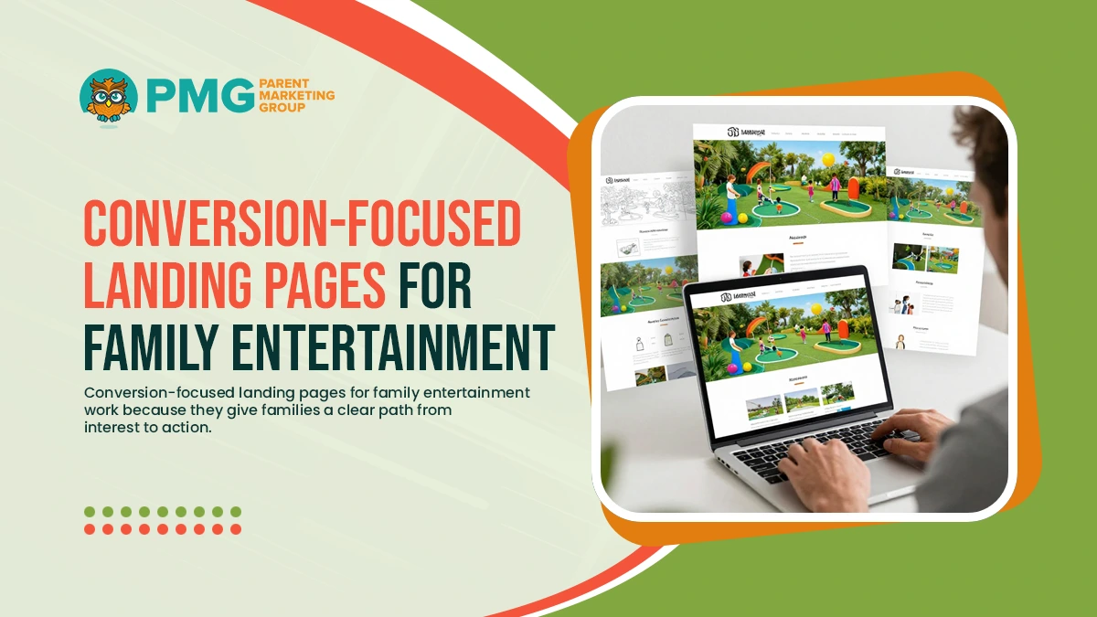
Conversion-focused landing pages for family entertainment work because they give families a clear path from interest to action. Instead of sending traffic to a general website, a dedicated landing page keeps the message consistent, limits distractions, and makes the next step feel simple. For mini golf promotions, this approach can increase booking volume, improve lead quality, and reduce cost per conversion because visitors know exactly what they are getting and how to claim it.
Match The Page To The Exact Promotion
Your headline, visuals, and offer details should mirror the ad or email that brought the visitor to your site. Keep the message tight and specific:
- Name the promotion clearly, including dates or restrictions
- Highlight what is included, not only what it costs
- Use the same language and imagery used in the campaign
When the page matches the promise, visitors are less likely to bounce.
Use A Simple Layout That Guides The Eye
Families often book from a phone, so structure matters. A reliable layout includes:
- A strong hero section with the offer and a primary button
- A short benefits section that answers why it is worth booking
- A quick “How It Works” block in three steps
- A short FAQ that removes hesitation
This flow creates clarity without forcing visitors to scroll through unnecessary pages.
Build Trust Without Adding Clutter
Trust signals help visitors feel comfortable paying or submitting details. Use a few that are easy to scan:
- Star ratings or short reviews
- Photos that show the course and guest experience
- Clear location and hours
- A brief note about group-friendly options, parties, or accessibility
If you have safety or cleanliness standards, state them in one concise line rather than a long paragraph.
Make It Easy To Track And Improve
A landing page should be measurable. Use tracking that ties outcomes back to marketing:
- Track button clicks, form starts, and completed bookings
- Use campaign tags so traffic sources remain clear
- Test one change at a time, such as the headline, image, or button text
When you treat each promotion page as a conversion tool, you build a repeatable system that improves results across campaigns.
Mini Golf Promotion Funnels That Align Ads, Offers, And Pages
Mini golf promotion funnels perform best when every step feels consistent. The ad sets the expectation, the offer provides a clear reason to act, and the landing page makes the next step easy. When any part of the flow is misaligned, visitors hesitate, bounce, or abandon the booking flow. A well-built funnel reduces wasted spend by guiding families from interest to purchase with fewer questions and fewer clicks.
Start With One Goal And One Audience
Before writing ads or building pages, define the single outcome you want. Examples include weekday tee time bookings, group event inquiries, or birthday party leads. Then choose one primary audience segment, such as:
- Families planning a weekend activity
- Parents looking for a birthday option
- Couples looking for a casual date night
- Camp groups, schools, or youth organizations
Clear targeting makes your message sharper and improves conversion.
Keep The Offer Consistent From Ad To Page
Your funnel should repeat the same promise, using the same terms. If the ad says “Family Four Pack,” the landing page should use the same name and explain what it includes. Keep the offer details easy to scan:
- What is included and who it is for
- Price and any limits, such as time windows
- Promotion dates and availability
- How to redeem, such as online booking or in-person purchase
Consistency reduces uncertainty and builds trust.
Use A Short Funnel With A Clear Next Step
Families respond well to simple choices. In most cases, the highest-performing funnel is:
- Promotion ad or email
- Dedicated landing page
- Booking or purchase confirmation
If you need a lead form instead of instant booking, add one step, then route leads into fast follow-up. Each added click reduces completion rates, so remove optional steps whenever possible.
Build The Landing Page Around Momentum
The landing page should immediately reinforce the offer and guide action. Include:
- A headline that repeats the promotion
- One primary call to action is placed above the fold
- A short “How It Works” section in three steps
- A small FAQ focused on common objections
If you offer multiple promotions, do not stack them on one page. Use one page per offer to keep the funnel focused.
Increase Booking Conversion For Mini Golf With Clear Calls To Action
To increase mini golf booking conversion, your call to action needs to do more than say “Book Now.” It should reduce hesitation, set expectations, and make the next step feel simple. Families often make quick decisions, especially on mobile, so the best calls to action are clear, visible, and repeated at the right moments. When CTAs are built intentionally, they improve conversion without requiring more traffic or deeper discounts.
Use One Primary CTA That Matches The Offer
Your landing page should have one main action tied to the promotion. Examples include:
- “Reserve Your Tee Time” for timed bookings
- “Claim The Family Four Pack” for a bundle offer
- “Request A Group Quote” for parties and events
Avoid mixing multiple primary actions on the same page. If you need a secondary option, keep it supportive, such as “Call To Book” for visitors who prefer speaking with a person.
Place CTAs Where Decisions Happen
A CTA should appear before visitors have to search for it. Strong placement includes:
- Above the fold in the hero section
- After the benefits or offer details
- Near social proof, such as reviews or photos
- At the end of the page, as a final prompt
For mobile, use a sticky button or a persistent booking bar when it fits your design. The goal is to make action available at every natural decision point.
Write CTA Copy That Reduces Friction
The best CTA language answers an unspoken question, such as what happens next or how long it takes. Use clear, specific phrasing:
- “Check Availability” instead of “Submit”
- “Choose Your Time Slot” instead of “Continue”
- “Lock In This Deal” when the offer is time-limited
Support the CTA with a short reassurance line, such as “Instant confirmation” or “No account required,” when accurate.
Test Small Changes That Add Up
CTA improvement is measurable. Test one variable at a time:
- Button text
- Placement and repetition
- Supporting the reassurance line
- Page section order
When calls to action are consistent, visible, and specific, they create momentum. That momentum is often the difference between browsing and booking.
Reduce Form Friction And Improve Mobile Experience
For mini golf promotions, most visitors will land on your page from a phone. If the form feels long, confusing, or difficult to complete on a small screen, conversions drop quickly. Reducing friction is not about collecting less information overall. It is about collecting only what is necessary upfront, then making the experience smooth enough that families finish the process without second-guessing.
Keep Forms Short And Purpose-Driven
Start by defining the single outcome. Booking requests and party inquiries require different details, so avoid one-size forms. In most cases, a high-converting form needs only:
- Name
- Phone or email
- Preferred date and time
- Group size or number of players
If you need more details, collect them after the initial submission or during confirmation.
Use Mobile-First Inputs And Layout
Small design choices make mobile forms easier to complete:
- Use larger fields with clear labels and spacing
- Enable numeric keypads for phone and party size fields
- Use dropdowns for time blocks instead of open text
- Add autofill-friendly fields and avoid unnecessary formatting rules
If the form is placed lower on the page, add a jump link near the top, such as “Start Your Booking,” to move visitors directly to the action.
Reduce Anxiety With Clear Expectations
Friction often comes from uncertainty. Add small reassurance elements near the form:
- A brief note about response time, such as same-day confirmation
- A short privacy statement that sets expectations
- A visible phone number for guests who prefer to call
These additions build trust without increasing clutter.
Make Submitting Feel Fast And Reliable
Your final step should feel effortless:
- Keep the button label specific, such as “Request Your Time Slot”
- Confirm success immediately with a thank-you message
- Send an automated confirmation via email or text
- Avoid sending users back to a general homepage after submission
When your form is short, mobile-friendly, and transparent, you improve conversions and make every promotion campaign more profitable.
Conclusion
High-converting landing pages for mini golf promotions succeed when they make a single offer easy to understand and easy to claim. When your ads, offers, and landing pages are aligned, visitors arrive with clear expectations and move through the page with confidence. Strong calls to action guide the decision, while mobile-friendly design and low-friction forms remove the barriers that cause families to abandon the process. With consistent testing and tracking, each promotion becomes an opportunity to improve conversion rates, reduce cost per lead, and drive more bookings from the same marketing spend.
Want landing pages that turn promotion traffic into booked tee times and event inquiries? Call (716) 303-4133 or visit https://parentmarketing.com/contact-us.